Soft Launch Feedback: FORUMS bugs, design issues, functionality issues
Forums are looking awesome. Heaps cleaner.
Agree with TJ re: Navigation links. Would be good to have the at the bottom of the page as well as the top to save scrolling back up.
Had issues with signing in this morning. Had to put in my email address a few times before it worked. Now even though it says email/username I can no longer login with my email (username only). When I try with email it just says invalid email. (Not sure if you are going to keep email login as an option but just in case…)
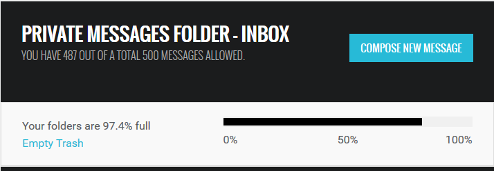
something fishy with private message counters
I just tried to click on “Mark all posts as read,” and it went into “Page not found.”
Design wise.
..I think this has been previously mentioned. This is very large and bit over powering maybe reduce the headers a bit. The hierarchy is a little to big and makes you over focus.
With the adverts to the shop, which I really like the way you have put them in to the news. Looks crisp but the enquire now is pushing the other news images shorter. You can’t make images with the enquire now on them? And make the whole image the link to the store?

So the more I’m browsing through the forum the more I like the desktop version, especially all the little features like profile picture next to username in the top task bar. I also like the new layout having the fast reply at the bottom rather than popping up in the middle of the screen.
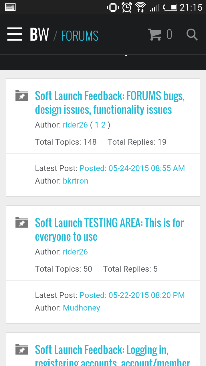
The mobile version, not so much. I think the reason is when browsing through sections on mobile you can only see one to two threads at the same time and they’re each in their own boxes rather than in a list like they used to be. It kinda feels zoomed it which makes it harder to know where abouts in the forum you are.
Once in a thread though I think it looks heaps better than the old version.
Thanks for all the feedback, guys. Working through these issues with our developers.
Please keep it coming.
Can the date format be changed from month/day/year to day/month/year or better still ‘5th May 2015’ style?
I agree. Will definitely look into it.
On my first log in on my phone i couldnt get the side menu bar thing to go away. This was on an android using firefox.
Ive tried to replicate it but it hasnt happened again yet, so could just be my phone on firefox having a spazz
Any reason we lost the page links at the bottom of the page?
I’d love to have one of these so when I want to go back to the main page / group I don’t need to scroll back to the top of the site.

We’ve decided to have this blue bar lock permanently under the black bar at the top. This way it’s always on the page. We figured this was even a better solution than having one at the top and bottom. What do you think?
Nice solution. Anyway to include page number navigation on that blue bar or at the top of the page? Currently its just at the bottom.
Also, low priority but my avatar isnt able to be changed. When I upload a new image it reverts to my previous one. Tried log out, log in but no cigar. Ive removed it for the time being.
Will definitely look into adding page navigation.
Can you please try to clear your browser’s cache and try again? Let me know if that doesn’t work.
Clearing the cache has sorted it, thanks mate.
Great. Thanks for letting me know. ![]()
Design wise.
..I think this has been previously mentioned. This is very large and bit over powering maybe reduce the headers a bit. The hierarchy is a little to big and makes you over focus.
With the adverts to the shop, which I really like the way you have put them in to the news. Looks crisp but the enquire now is pushing the other news images shorter. You can’t make images with the enquire now on them? And make the whole image the link to the store?
I agree on the top point. We’ll look at improving the design of this after we work through the bugs and functionality.
In regards to the ad, we did this purposely to give it a bit of distinction in the content flow. We want it to stand out a bit. Article thumbnails are 3:2 while ads are standard MREC (300x250). We wanted them worked into the content flow as we feel this is less intrusive and also ads value to the ads, however they do need need to stay true to their form. Thoughts?